Learning Material
Package Loading
As mentioned within the session setup, load the following packages using the library() function.
  library(tidyverse)
  library(RColorBrewer)
  library(ghibli)
  library(palettetown)
Introduction
Example Plot:
To give you an example of how to generally plot in R, using ggplot2, we can examine the diamonds data set. This is an extremely common example, but is useful to understand how to structure of how to plot.
# Chunk 1
  ggplot(data = diamonds,
         mapping = aes(x = price,
                       y = carat,
                       colour = cut)) +
# Chunk 2
  geom_point() +
# Chunk 3
  labs(title = "Diamonds Plot Example",
       x = "Price",
       y = "Carat")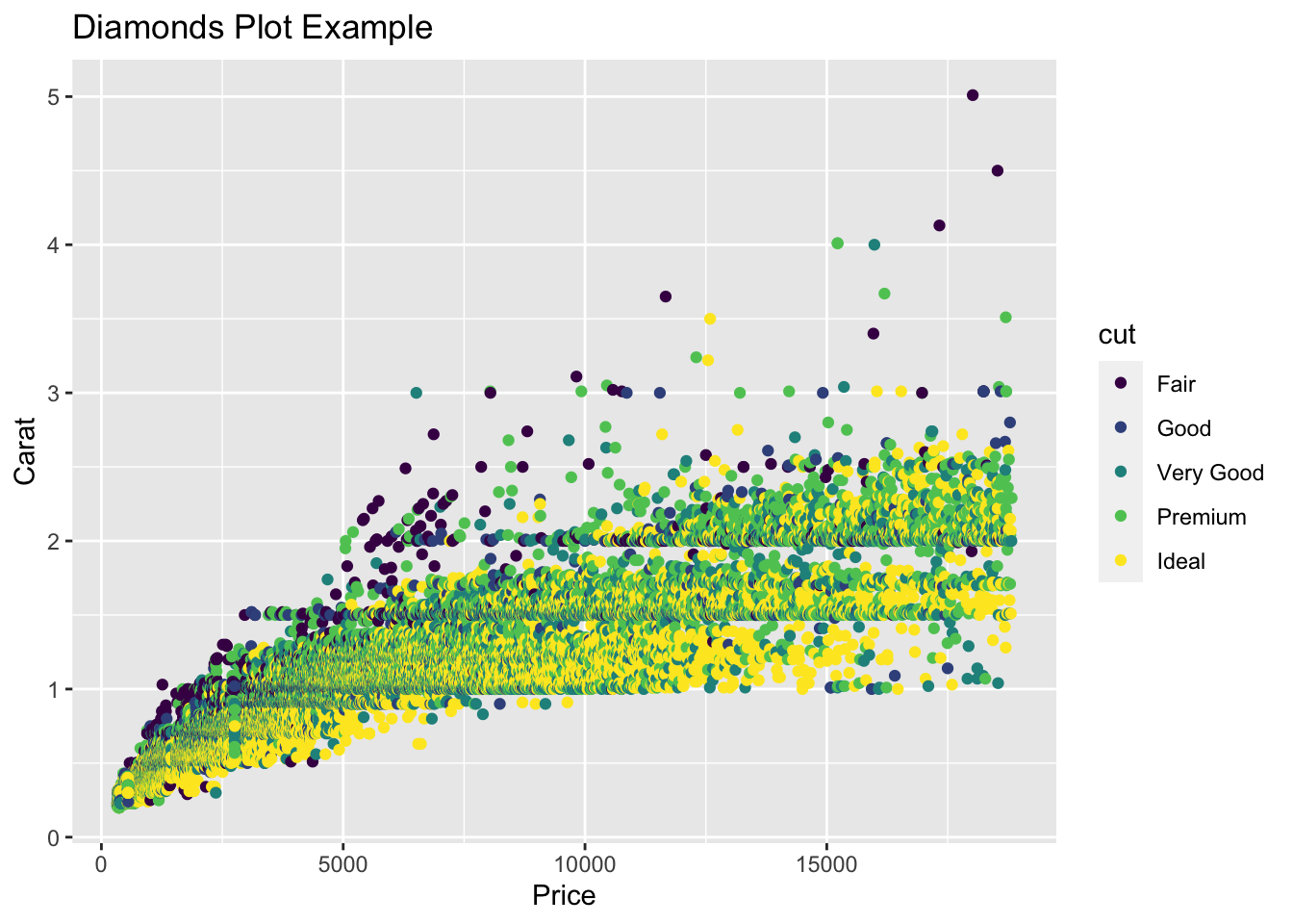
We can break down the code for this plot into three Chunks.
- Chunk 1:
ggplot()function, this is the core part of any visualization function, and typically contains information such as specification of the data to be used, and the mapping aesthetics. These details however can also be included within Chunk 2. - Chunk 2:
geomspecification, details which type of plot you would like to plot. In this case, we are plotting a point chart, or scatter plot. - Chunk 3: Additional Details, such as
labs(). In this case, specifying the labels which should be included alongside your plot.
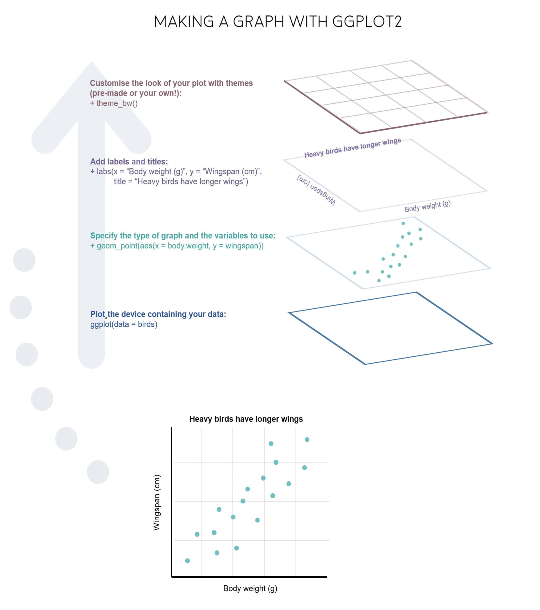
These three components (that is the ggplot function, the geom specification and additional details) are core components of any data visualization. And can be summed up also in the diagram below.
Alternatively, this code can be written as so, and produce the same results.
# Chunk 1
  ggplot() +
# Chunk 2
  geom_point(data = diamonds,
         mapping = aes(x = price,
                       y = carat,
                       colour = cut)) +
# Chunk 3
  labs(title = "Diamonds Plot Example",
       x = "Price",
       y = "Carat")
Understanding that there are multiple methods of achieving the same result is incredibly important, especially during programming in R.
Layered Coding
As you can see, these visualizations are made up of lots of smaller components. These changeable aspects include:
geom functions
geom_line()- line chartsgeom_point()- scatter plotsgeom_polygon()- shape diagrams
Aesthetic Descriptors
These are used within the function, aes = mapping()
- Fill = - inside/fill colour
- Colour = - Border colour
- Alpha = - Transparency Level (0 -> 1)
- Linetype = - Line Type / Border Type
- Size = - Border thickness / Point Size
- Shape = - Point Shape
Themes
theme()- base themetheme_bw()- black and white themetheme_void()- empty theme (no scales, legends etc)theme_minimal()- minimal theme
Scales
labs(),xlab(),ylab(),ggtitle()- Labelslims(),xlim(),ylim()- Scale Limitsscale_x_log10(),scale_y_log10()- Log Scales
Coordinate Systems
coord_cartesian()- Cartesian Coordinate Systemcoord_polar()- Polar Coordinate System
Understanding Polar Coordinates
Coordinates on the x-axis indicate the circular movement.
Coordinates on the y-axis indicate the distance of the points from the origin.
The origin of the plot is defined as the centre of the plot
The plot begins and ends at the top of the plot (before rotating right)
Incorporating colour
When it comes to applying colour to the plots you produce, there again are multiple ways in which these can be defined. This includes:
Base R:
- Blue:
"blue" - Red:
"red"
Hex/RGB Code:
- Blue: #0074D9
- Red: #FF4136
Palettes from R Packages
- RColorBrewer
- ghibli (colours inspired by Studio Ghibli Films)
- palettetown (colour inspired by pokemon)
Practical Exercises