Learning Material
Basic theory of Good Practice for Graph Production
The current theory for good practice in graph production is driven by Edward Tufte. As a pioneer across the field of data visualisation, his principles can be summarized as:
- Ensure the representation is “most fit for purpose”.
- Have a high data-to-ink ratio, that is the most information, in the shortest time, using the least about of ink in the smallest space.
- Ensure that graph upholds visual integrity, that no distortion or false impressions are created through the interpretation of the data or plot.
- Sometimes simplicity is the easy way to display highly complex information.
As a whole, although this is directly encouraged for graphical production in business, these values should be upheld in the realm of research. Since the traditional adage is true, a “picture is worth a thousand words”, especially when it comes to expressing complex, novel or important information.
Data: Online Gaming Anxiety Data
Within this practical we will be using the Online Gaming Anxiety Data. This dataset was collected as part of a survey among around 15,000 gamers worldwide, and examines participants response on questionnaires such as GAD-7, SWL, SPIN as well as other demographic details. This data was selected as it contains a large amount of research data, similar to those which session participants are likely to come across in their research. For the purpose of this session, a sample of 5,000 (around 30%) of the participants.
Plotting in R, ggplot2 vs plot
When comparing methods of plotting within R, most packages will be based upon one of two styles, The base R plot() function, or the Tidyverse ggplot() function. Although both are useful, both can be seen to have limitations in their usage.
plot()
The plot() function, is ideal for quick and dirty scatter plotting, requiring only three basic parameters, data =, and y ~ x. And although variants do exist for bar plots (barplot()), histograms (hist()) and others, these (in my opinion) require more knowledge about their individual functions than the ggplot() system as a whole. This being said, for those who wish to generate (and master) one particular type of plot, this function may be more ideal.
ggplot()
As mentioned previous, ggplot() is a much more diverse function, which allows for a standard method of plotting across different plot types, with only minor variants depending on the type. This function (as seen in Figure 1, below) works through the layering of multiple information based layers in order to form a plot. This makes it ideal for plotting multiple layers of clear information with the capacity to edit areas at the individual or global level accordingly.
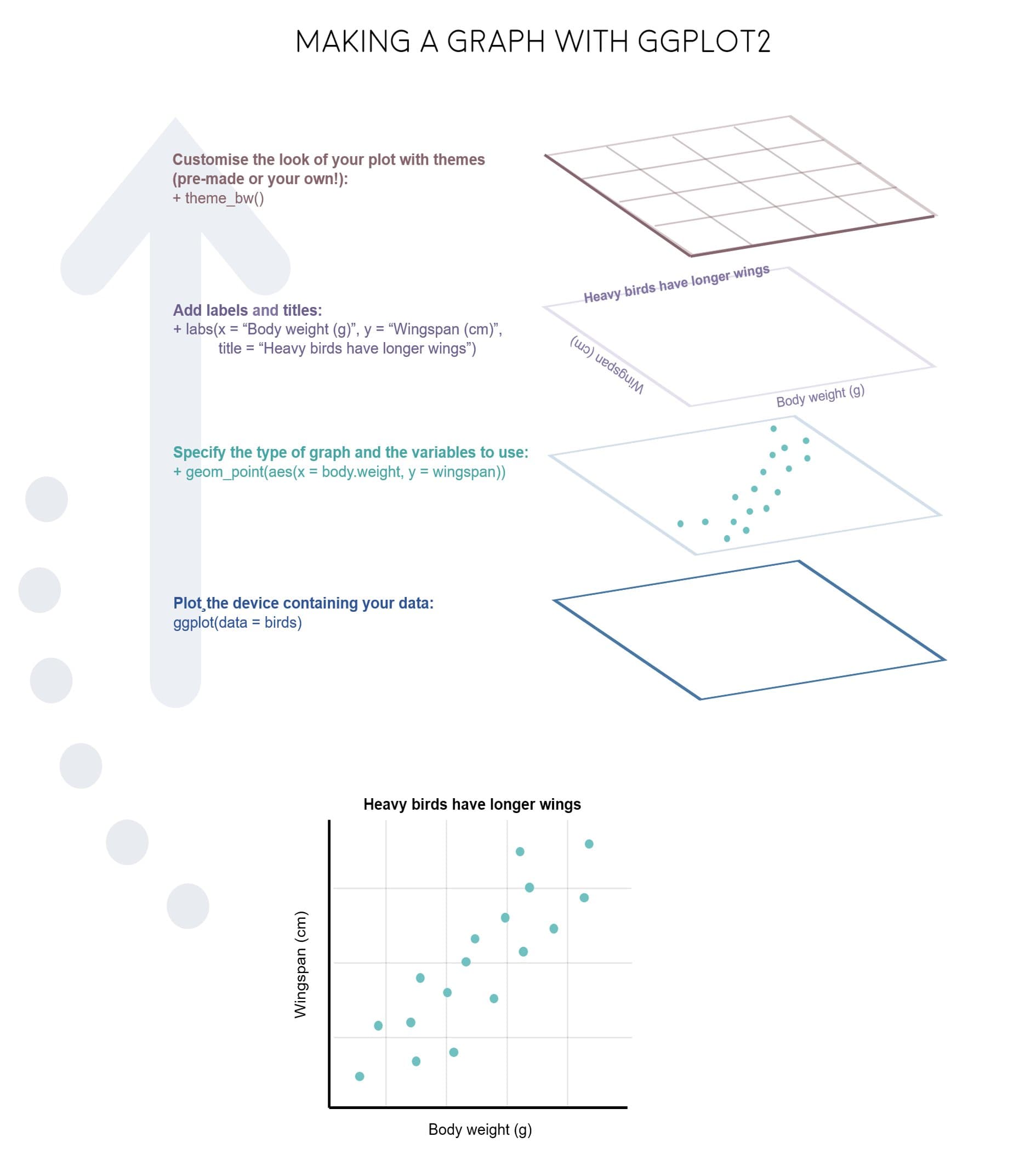
Figure 1
Overall, although both methods are useful, this session will focus on using ggplot() given is accessibility and standard practice, making it easier to create beautiful plots.
Graphics for Publications
As a whole, publications (such as Nature, Elsevier and those from the Taylor and Francis Group) ask that graphs, charts or schematics be published in one of several formats, EPS, TIFF or PSD. Using ggsave() or the export option in your RStudio Console, you can typically export a graph or image in the following formats: PNG, JPEG, TIFF, BMP, SVG, EPS.
Therefore, for any publications it is recommended you use either EPS (file extension .eps), or TIFF (file extension .tif / .tiff). Or export the entire document plus graphs as a PDF (.pdf). Additionally, for most publications they request a resolution (dpi) or above 300, be warned that anything above 1000dpi typically takes a while to render (but ensures a high quality). This is covered further in the practical section of this workshop.
ggplot2 functions
For a full list you can refer to the ggplot2 reference page, or the PDF Cheat Sheet. However a brief summary of some of these functions can be seen below.