Solutions
Package and Data Loading
As mentioned within the session setup, load the following packages using the library() function. Additionally, as we will be using a data set with large numbers, set scipen to 999 using the option function.
  library(tidyverse)
  library(RColorBrewer)

  options(scipen = 999)
Furthermore, for the purpose of this session, we will be using data from the World Bank Open Data. In particular we will be using a collection of variables from 1999, these variables were selected to provide us plenty of room to explore!
It is included in your downloaded zip file from the accompanying Github Repo and can be loaded using the following code:
WDB_1999 <- read_csv("../data/WDB_1999.csv")Section 1: ggplot2 vs plot
Exercise 1: Plotting birthrate against deathrate using both the plot() and ggplot() function, discuss which has more potential in displaying data clearly.
## Plotting using plot()

  plot(data = WDB_1999,
       birthrate ~ deathrate)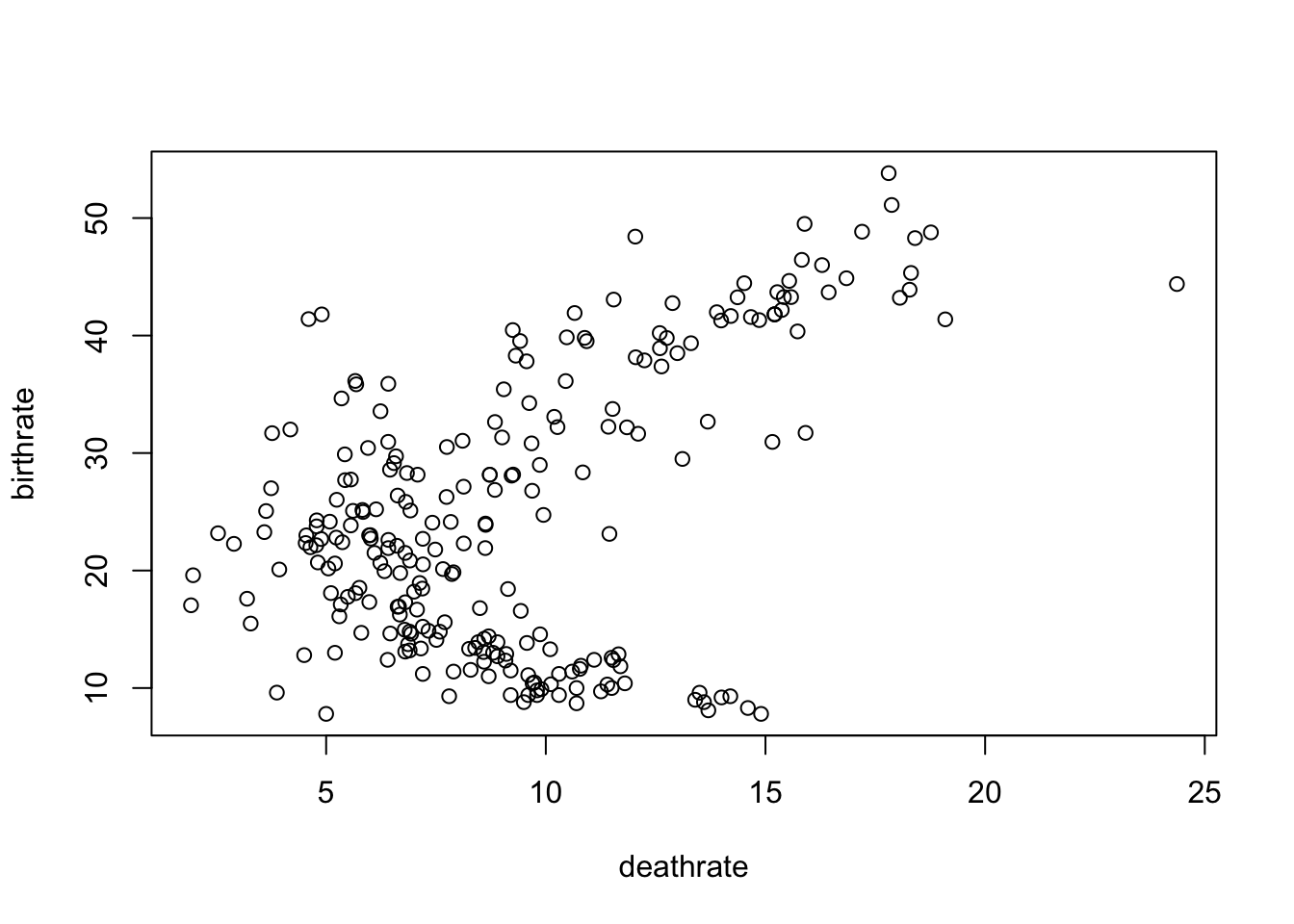
## Plotting using ggplot()

  ggplot(data = WDB_1999,
         mapping = aes(
           x = deathrate,
           y = birthrate
         )) +
    geom_point()
## Warning: Removed 17 rows containing missing values (geom_point).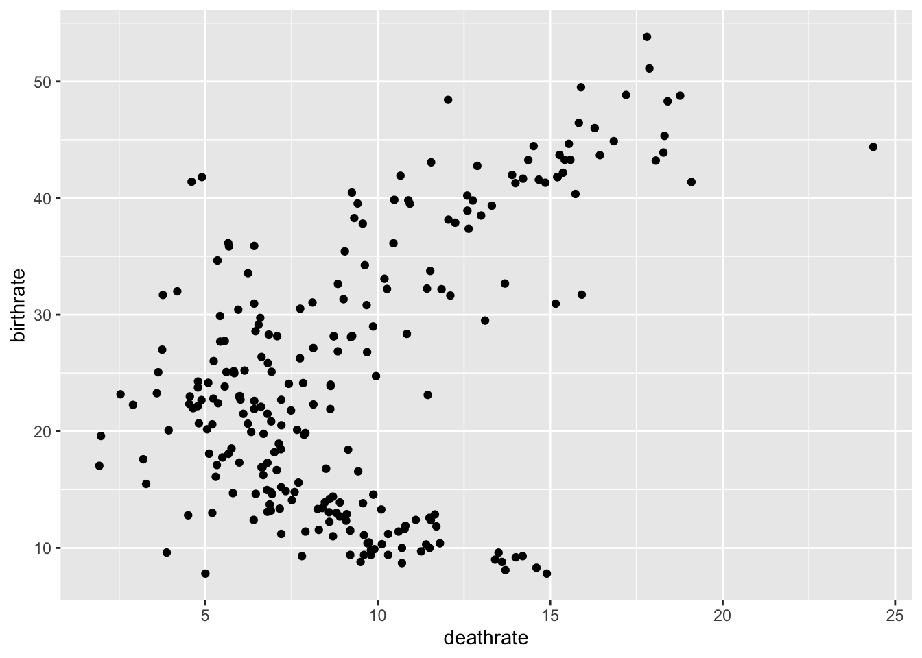
Exercise 2: Expand the plot to group these points by Continent, which provides us with more information and is easier to achieve? Remember, you’ll need to recode WDB_1999$Continent as a factor using the function:
## Plotting using plot()

WDB_1999$Continent <- as.factor(WDB_1999$Continent)

  plot(data = WDB_1999,
       birthrate ~ deathrate,
       col = c("blue", "light blue", "red", "pink",
             "green", "dark green", "black", "purple")[Continent])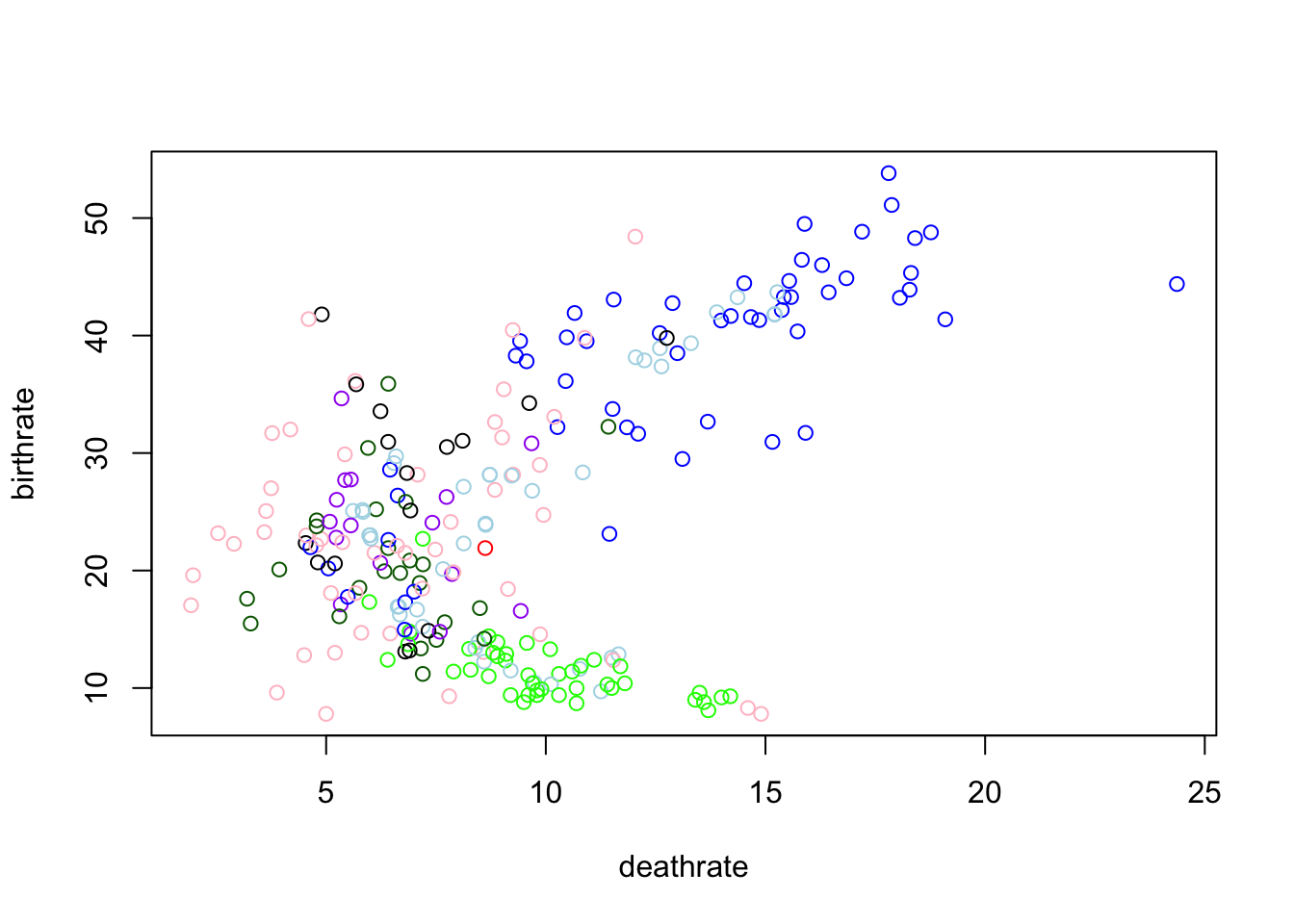
## Plotting using ggplot()

  ggplot(data = WDB_1999,
         mapping = aes(
           x = deathrate,
           y = birthrate,
           colour = Continent
         )) +
    geom_point()
## Warning: Removed 17 rows containing missing values (geom_point).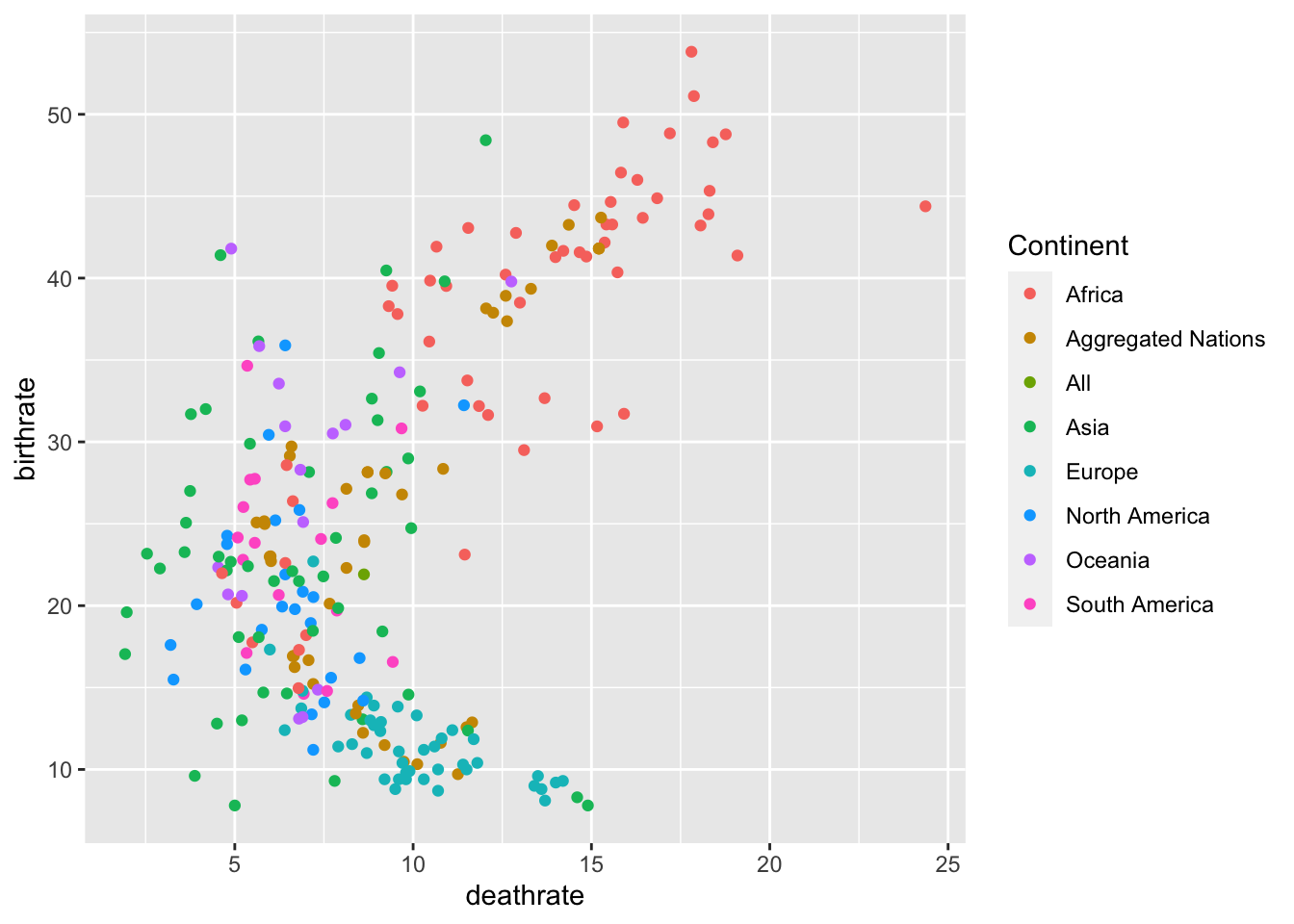
Section 2: Scatter Plots in ggplot
Exercise 3: Change the size parameter to ed.years to see if there is a trend between amount of years in Education and the Birth and Death Rate, set the alpha parameter to 0.5 to clearly see the relationships.
  ggplot(data = WDB_1999,
         mapping = aes(
           x = birthrate,
           y = deathrate,
           colour = Continent,
           size = ed.years
         )) +
    geom_point(alpha = 0.5)
## Warning: Removed 69 rows containing missing values (geom_point).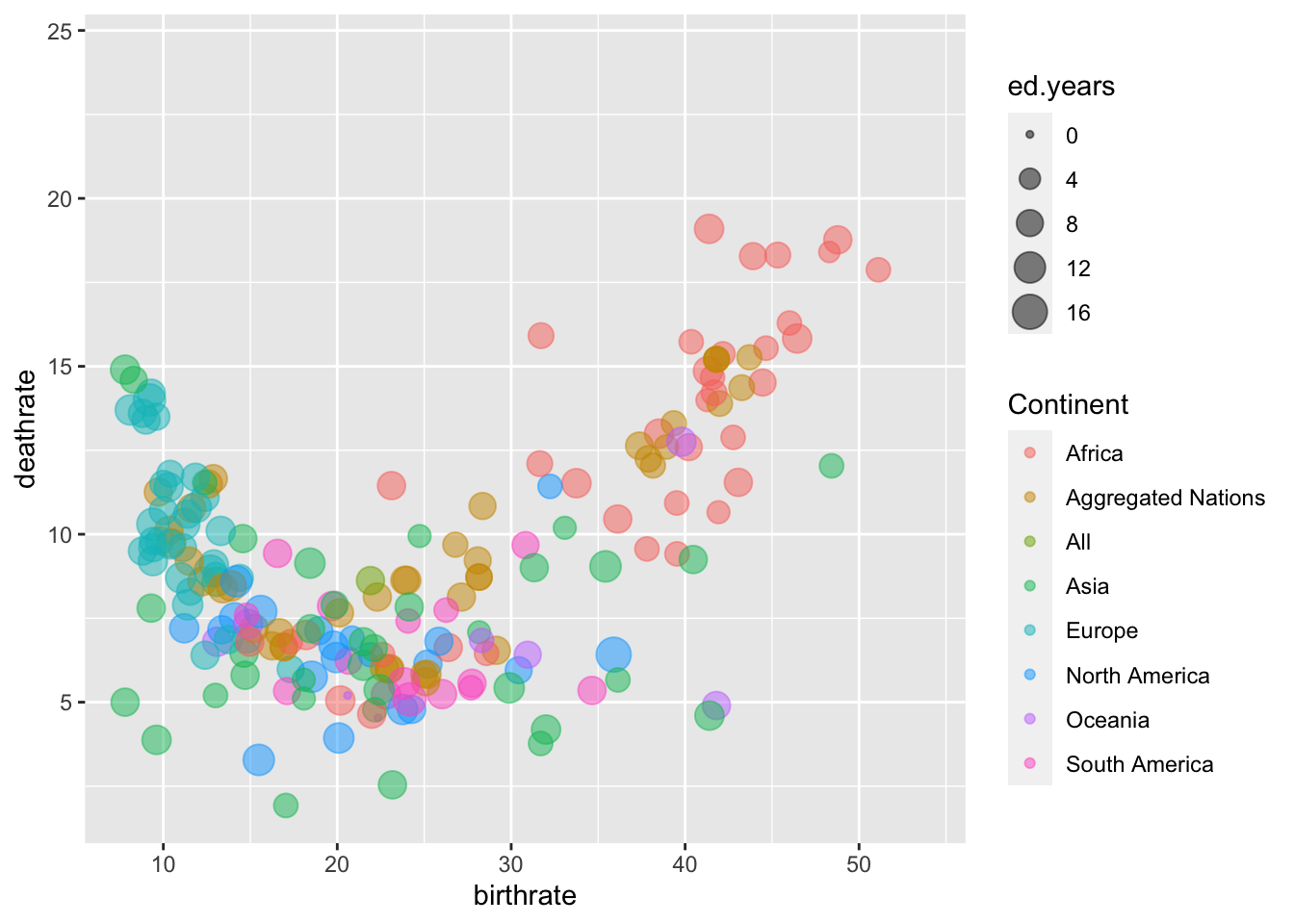
Exercise 4: Change the Labels on the X and Y axis’ and provide a suitable title for the graph
  ggplot(data = WDB_1999,
         mapping = aes(
           x = birthrate,
           y = deathrate,
           colour = Continent,
           size = ed.years
         )) +
    geom_point(alpha = 0.5) +
  labs(x = "Birth Rate",
       y = "Death Rate",
       title = "Interaction between Birth and Death Rate.")
## Warning: Removed 69 rows containing missing values (geom_point).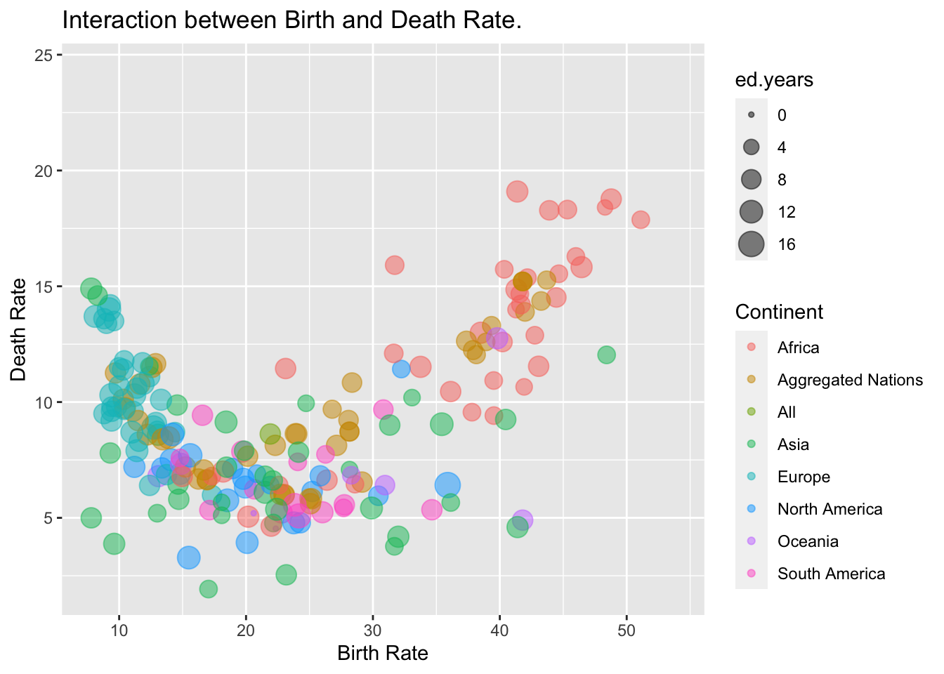
Section 3: Bar Charts and Histograms
Exercise 5: Using the parameter stat = "identity" within the geom_bar() function, create a bar chart of Continent plotted against the mean birthrate or deathrate
  ggplot(data = WDB_1999) +
    geom_bar(stat = "identity",
             mapping = aes(x = Continent,
y = mean(birthrate, na.rm = TRUE))) 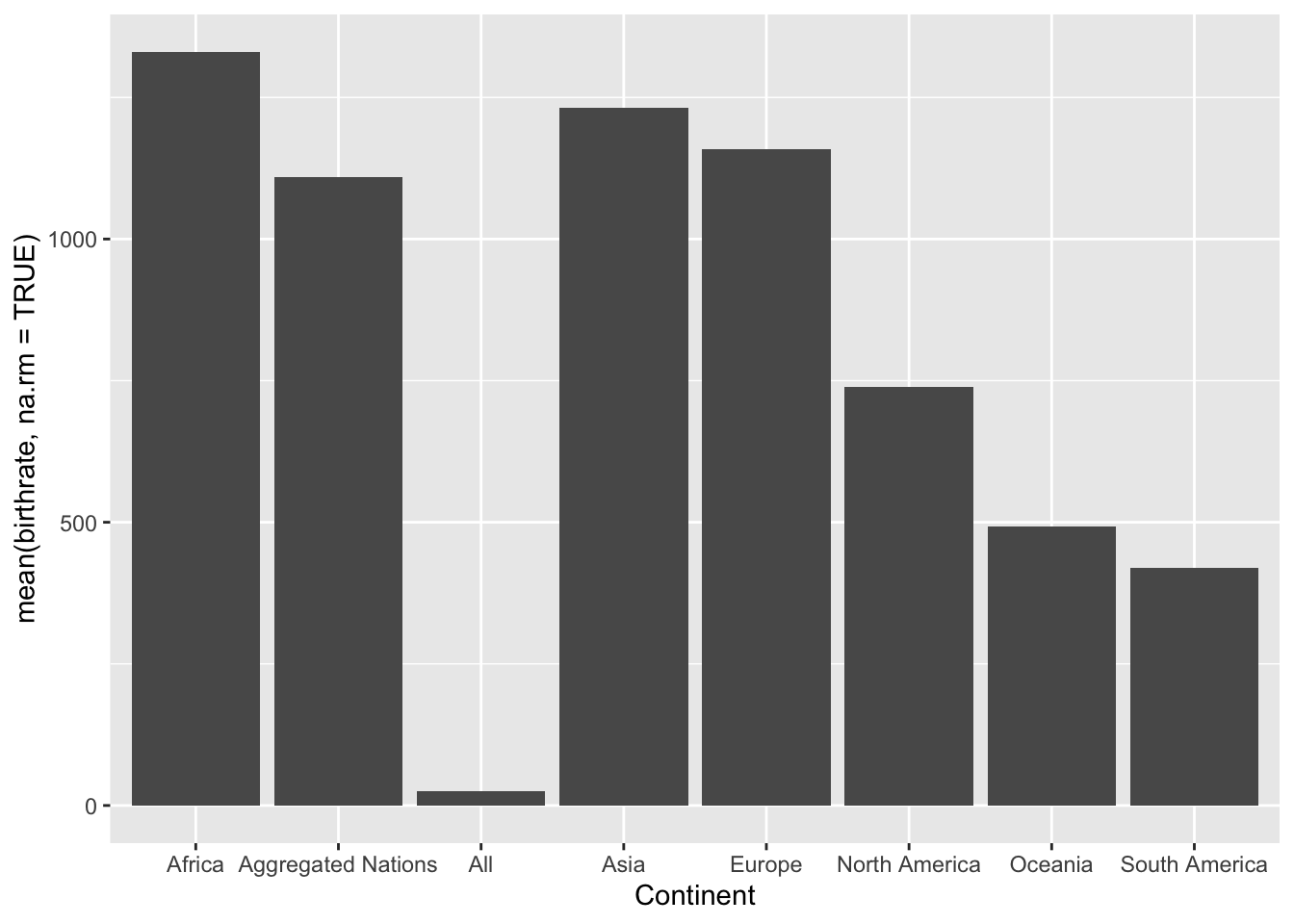
  ggplot(data = WDB_1999) +
    geom_bar(stat = "identity",
             mapping = aes(x = Continent,
y = mean(deathrate, na.rm = TRUE))) 
Exercise 6: Using the function geom_histogram() create a histogram of the birthrate and deathrate
  ggplot(data = WDB_1999) +
    geom_histogram(mapping = aes(x = birthrate), colour = "blue", alpha = 0.5) +
    geom_histogram(mapping = aes(x = deathrate), colour = "red", alpha = 0.5)
## `stat_bin()` using `bins = 30`. Pick better value with `binwidth`.## Warning: Removed 16 rows containing non-finite values (stat_bin).## `stat_bin()` using `bins = 30`. Pick better value with `binwidth`.## Warning: Removed 17 rows containing non-finite values (stat_bin).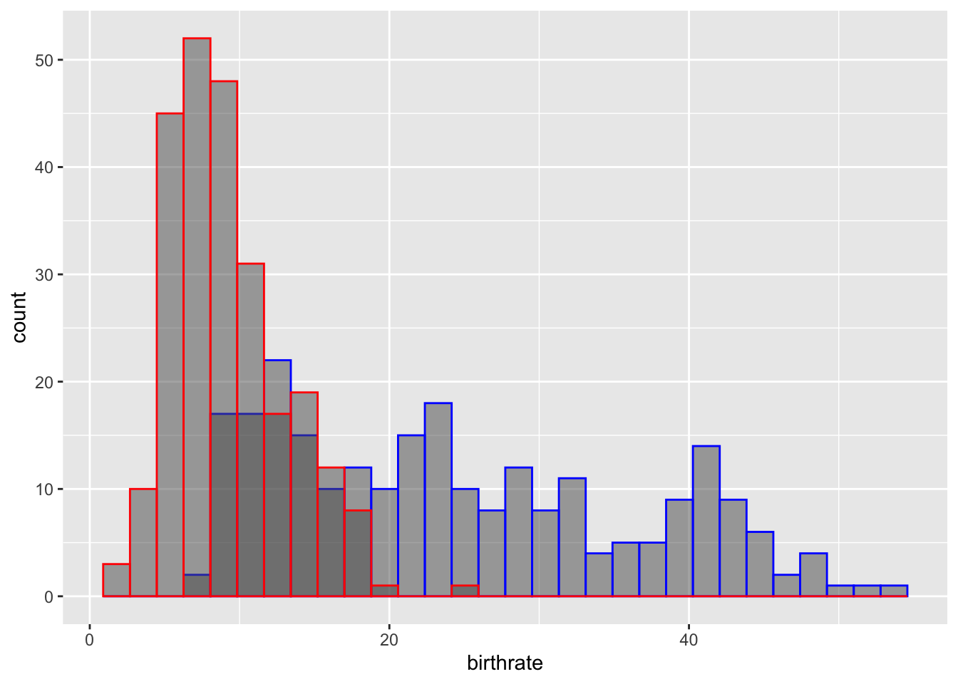
Section 4: Adding density plots to Histograms
Exercise 7: Using the plot created in exercise 6, add the y-variable ..density.. and binwidth = 1 to geom_histogram() in addition to adding geom_density() to add density lines to the Histogram
  ggplot(data = WDB_1999) +
    geom_histogram(mapping = aes(x = birthrate, y = ..density..), binwidth = 1,
                   colour = "blue", alpha = 0.5) +
    geom_histogram(mapping = aes(x = deathrate, y = ..density..), binwidth = 1,
                   colour = "red", alpha = 0.5) +
    geom_density(mapping = aes(x = birthrate), colour = "blue", alpha = 0.5) +
    geom_density(mapping = aes(x = deathrate), colour = "red", alpha = 0.5)
## Warning: Removed 16 rows containing non-finite values (stat_bin).## Warning: Removed 17 rows containing non-finite values (stat_bin).## Warning: Removed 16 rows containing non-finite values (stat_density).## Warning: Removed 17 rows containing non-finite values (stat_density).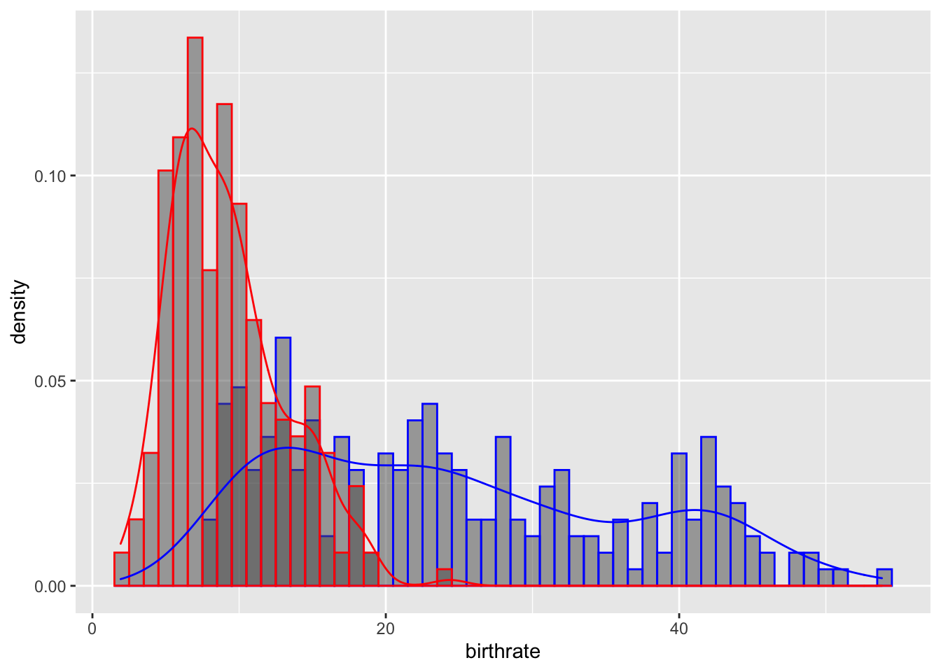
Exercise 8: Add the parameter, adjust = 2 in the density plot, to smooth this link and make it more easily interpretable
  ggplot(data = WDB_1999) +
    geom_histogram(mapping = aes(x = birthrate, y = ..density..), binwidth = 1,
                   colour = "blue", alpha = 0.5) +
    geom_histogram(mapping = aes(x = deathrate, y = ..density..), binwidth = 1,
                   colour = "red", alpha = 0.5) +
    geom_density(mapping = aes(x = birthrate), colour = "blue", alpha = 0.5, adjust = 2) +
    geom_density(mapping = aes(x = deathrate), colour = "red", alpha = 0.5, adjust = 2)
Section 5: Extra Useful Tips and Functions
Exercise 9: Use the ggsave() function to save your last plot
ggsave(filename = ??,
       plot = last_plot())