Solutions
Package and Data Loading
As mentioned within the session setup, load the following packages using the library() function. Additionally, as we will be using a data set with large numbers, set scipen to 999 using the option function.
  library(tidyverse)
  library(RColorBrewer)
  library(ggpubr)

  options(scipen = 999)
Next load in the data, make relevant adjustment converting the Continent String variable into a Factor variable.
WDB_1999 <- read.csv("../data/WDB_1999.csv")
WDB_1999$Continent <- factor(WDB_1999$Continent)
Section 1: Specifying the Visual Space
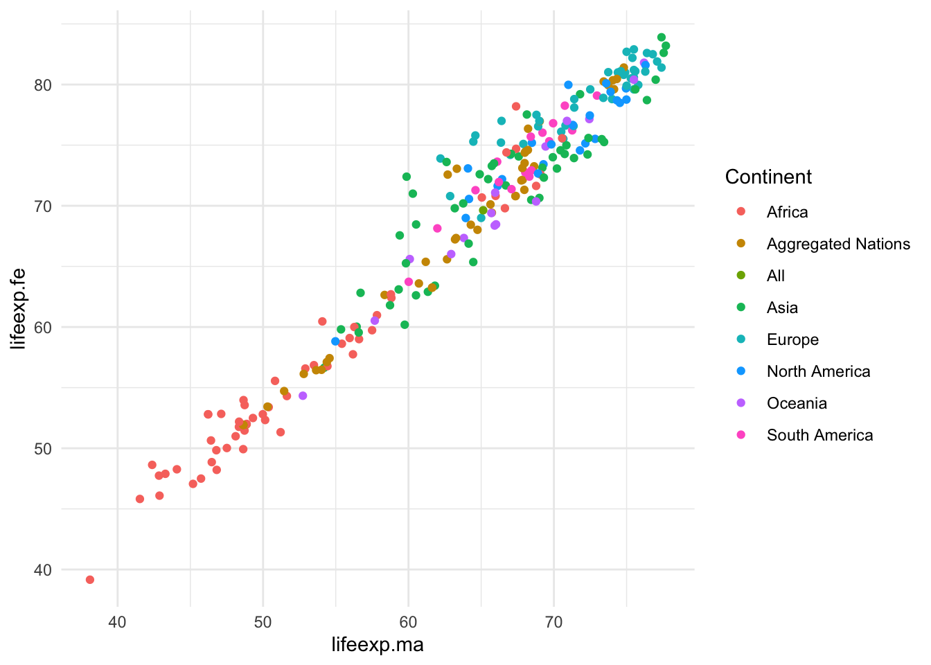
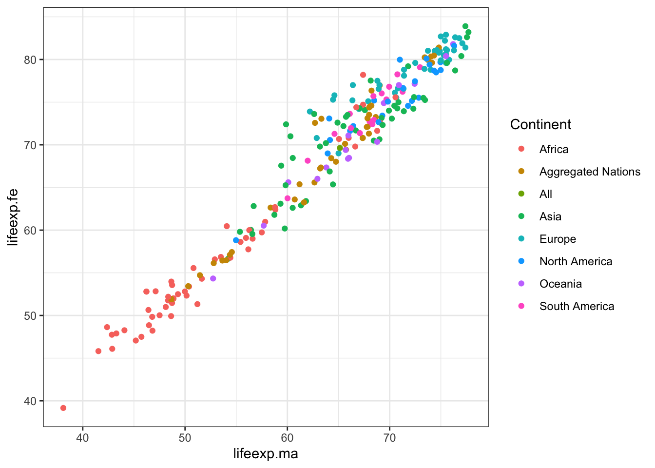
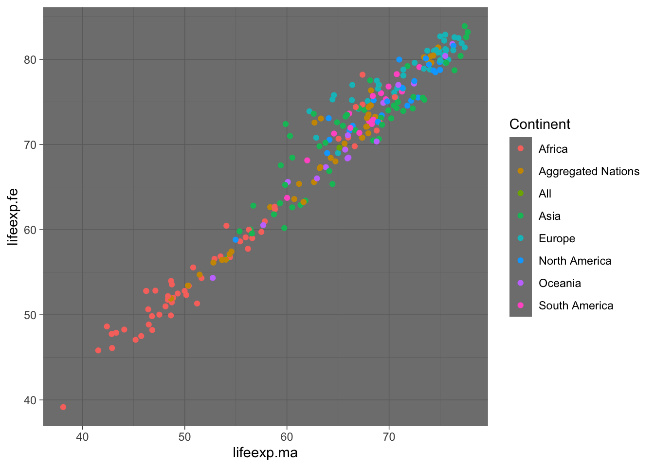
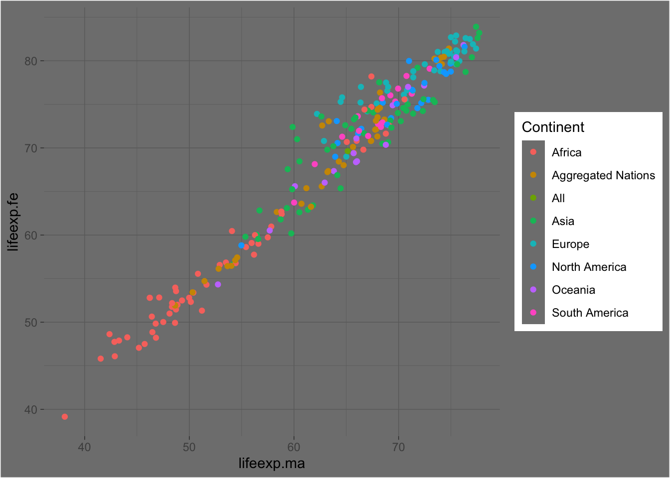
Exercise 1: Using the example code provided, add two of the themes listed below. How are these themes different? Under what situations would one of these themes be better than another?
ggplot() +
  geom_point(data = WDB_1999,
             mapping = aes(x = lifeexp.ma,
                           y = lifeexp.fe,
                           colour = Continent)) +
theme_minimal()ggplot() +
geom_point(data = WDB_1999,
mapping = aes(x = lifeexp.ma,
y = lifeexp.fe,
colour = Continent)) +
theme_bw()ggplot() +
geom_point(data = WDB_1999,
mapping = aes(x = lifeexp.ma,
y = lifeexp.fe,
colour = Continent)) +
theme_dark()Possible themes:
- theme_bw()
- theme_classic()
- theme_dark()
- theme_light()
- theme_minimal()
- theme_void()
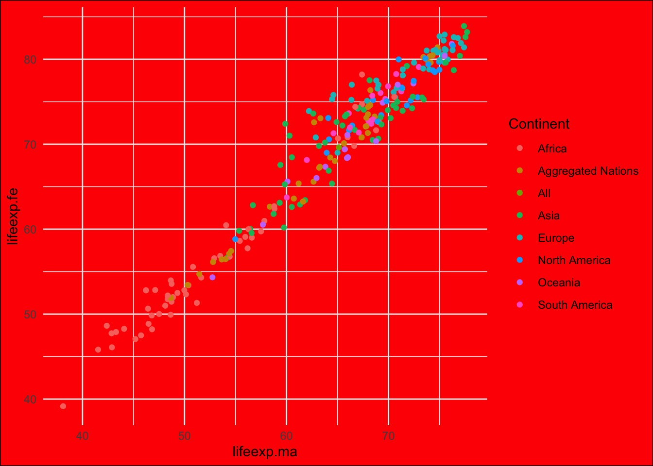
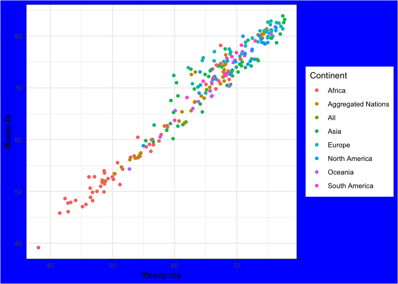
Exercise 2: Using your preferred theme function from exercise 1; add another theme layer (using theme()), specifying a novel background colour, you can use the template provided. Simply replace “XXX” with a colour of your choice.
ggplot() +
  geom_point(data = WDB_1999,
             mapping = aes(x = lifeexp.ma,
                           y = lifeexp.fe,
                           colour = Continent)) +
  theme_minimal() +
theme(plot.background = element_rect("red"))ggplot() +
geom_point(data = WDB_1999,
mapping = aes(x = lifeexp.ma,
y = lifeexp.fe,
colour = Continent)) +
theme_bw() +
theme(plot.background = element_rect("blue"))ggplot() +
geom_point(data = WDB_1999,
mapping = aes(x = lifeexp.ma,
y = lifeexp.fe,
colour = Continent)) +
theme_dark() +
theme(plot.background = element_rect("grey50"))Exercise 3: Going Further: run the command “?theme”. When doing so, explore the large range of potential adaptions, spend some time deploying these to understand the potential adaptions you can make. When doing so, do not forget to provide the following where relevant:
- element_text()
- element_rect()
- element_line()
?themeSection 2: Specifying the axis’s
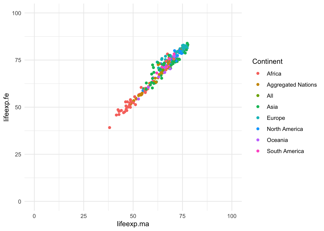
Exercise 4: Using an alternative to theme, increase the limits of the x & y axis. Hint: Use lims(y = c(), x = c()), placing the limits at 0 & 100
  ggplot() +
    geom_point(data = WDB_1999,
               mapping = aes(x = lifeexp.ma,
                             y = lifeexp.fe,
                             colour = Continent)) +
    theme_minimal() +
    lims(y = c(0,100), x = c(0,100))
Exercise 5: Currently the produced graph breaks the axis scale every 25 years, using the example provided, use scale_y_continuous & scale_x_continuous. To specify both limits and specific breaks (every 20) in the axis, you can use, n.breaks or breaks to specify the breaks.
  ggplot() +
    geom_point(data = WDB_1999,
               mapping = aes(x = lifeexp.ma,
                             y = lifeexp.fe,
                             colour = Continent)) +
    theme_minimal() +
    scale_x_continuous(breaks = seq(from = 0, to = 100, by = 10), limits = c(0, 100)) +
    scale_y_continuous(n.breaks = 5, limits = c(0, 100))
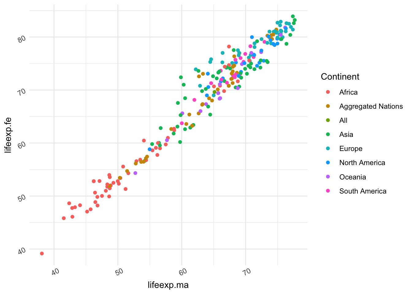
Exercise 6: Using the code you generated in Exercise 5, add in specification of the angle of break labels using axis.text.x and axis.text.y respectively. Ensure to add these in a theme() layer.
  ggplot() +
    geom_point(data = WDB_1999,
               mapping = aes(x = lifeexp.ma,
                             y = lifeexp.fe,
                             colour = Continent)) +
    theme_minimal() +
    theme(axis.text.x = element_text(angle = 27), axis.text.y = element_text(angle = 27))
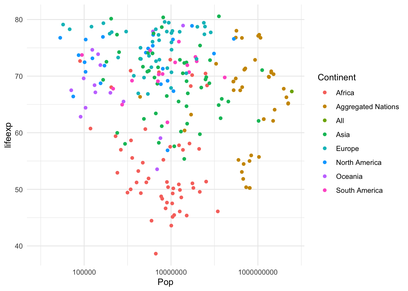
Exercise 7: Now considering the relationship between population and life expectancy. Plot these two variables using a scatter plot, using a log10 scale for population.
  ggplot() +
    geom_point(data = WDB_1999,
               mapping = aes(x = Pop,
                             y = lifeexp,
                             colour = Continent)) +
    theme_minimal() +
    scale_x_log10()
Section 3: Specifying Labels
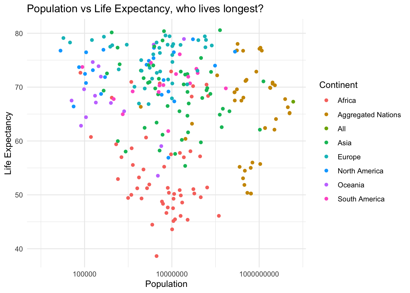
Exercise 8: Using the layer definition labs(), generate names for the x, y and title, for the plot in exercise 7
ggplot() +
    geom_point(data = WDB_1999,
               mapping = aes(x = Pop,
                             y = lifeexp,
                             colour = Continent)) +
    theme_minimal()  +
    scale_x_log10() +
    labs(title = "Population vs Life Expectancy, who lives longest?",
         x = "Population", y = "Life Expectancy")
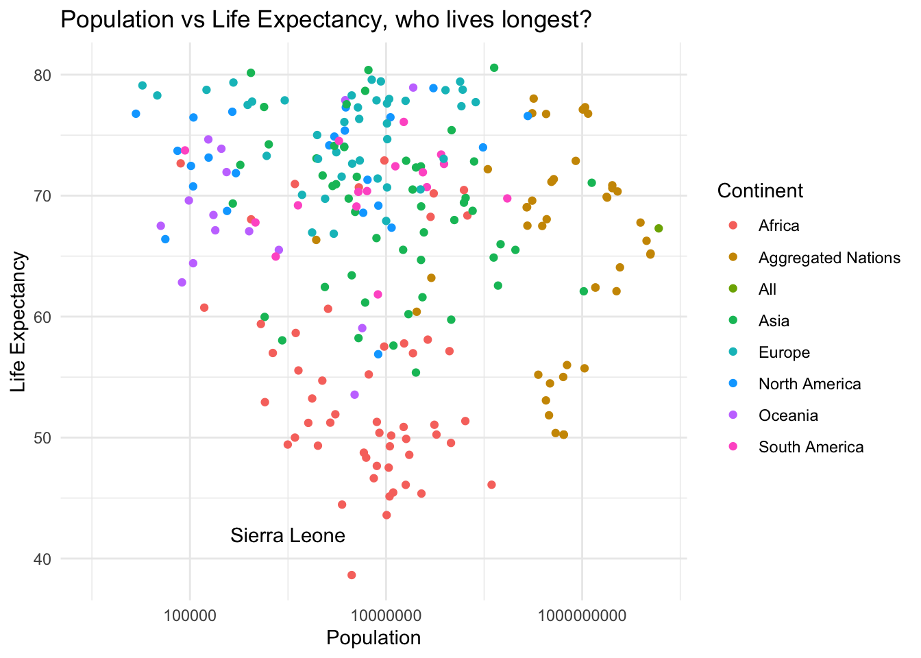
Exercise 9: Using the plot generated in Exercise 8, indicate the nation with the lowest life expentancy, adding an annotation, labeling “Sierra Leone” at x = 1000000, y = 42
  ggplot() +
    geom_point(data = WDB_1999,
               mapping = aes(x = Pop,
                             y = lifeexp,
                             colour = Continent)) +
    theme_minimal()  +
    scale_x_log10() +
    labs(title = "Population vs Life Expectancy, who lives longest?",
         x = "Population", y = "Life Expectancy") +
    annotate(geom = "text", label = "Sierra Leone", x = 1000000, y = 42)
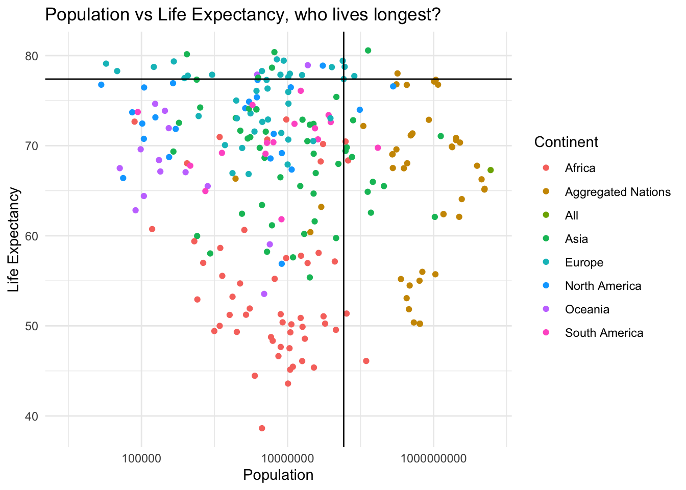
Exercise 10: Add two reference lines (indicating the UK) in life expectancy and Population, build this upon exercise 9, and use x & y intercept points as x = 58682466, y = 77.39024
  ggplot() +
    geom_point(data = WDB_1999,
               mapping = aes(x = Pop,
                             y = lifeexp,
                             colour = Continent)) +
    theme_minimal()  +
    scale_x_log10() +
    labs(title = "Population vs Life Expectancy, who lives longest?",
         x = "Population", y = "Life Expectancy") +
    geom_vline(xintercept = 58682466) +
    geom_hline(yintercept = 77.39024)
Section 4: Specifying Layouts
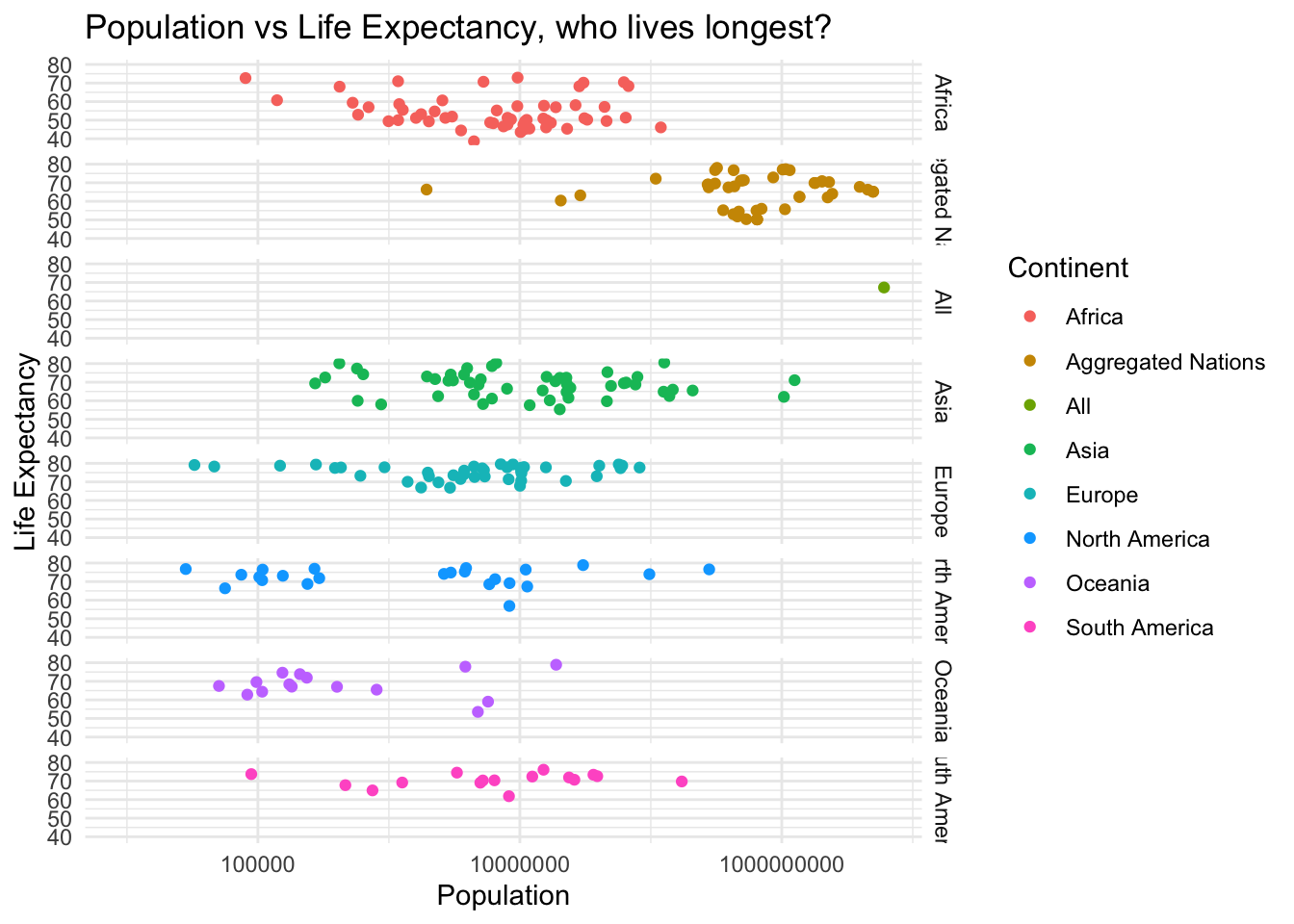
Exercise 11: Using facet_grid(), generate a matrix of panels for the multiple continents, build this upon Exercise 10. Consider the issue(s) with using this facet style?
  ggplot() +
    geom_point(data = WDB_1999,
               mapping = aes(x = Pop,
                             y = lifeexp,
                             colour = Continent)) +
    theme_minimal()  +
    scale_x_log10() +
    labs(title = "Population vs Life Expectancy, who lives longest?",
         x = "Population", y = "Life Expectancy") +
    facet_grid(rows = vars(Continent))
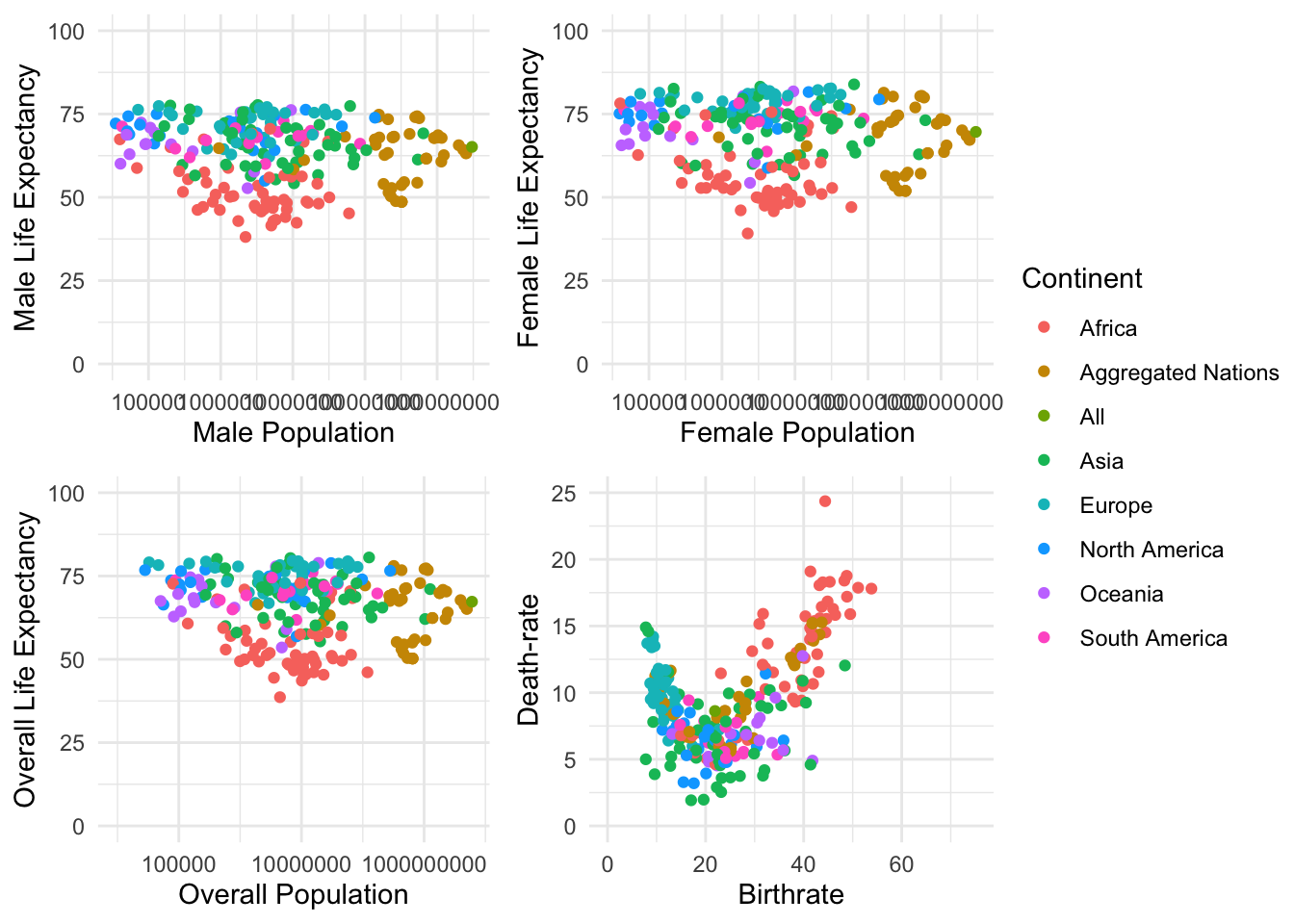
Exercise 12: Generate the following plots, assigning each to a relevant variable name (plot_1 : plot_4) Using ggarrange, combine these four plots into one visualisation
- plot_1 -> Scatter plot, between Male Population & Male Life expentancy
- plot_2 -> Scatter plot, between Female Population & Female life expentancy
- plot_3 -> Scatter plot, between Overall Population & Overall Life expentancy
- plot_4 -> Scatter plot, birthrate & deathrate
For each ensure to set colour as continent, and that they share a common legend, setting common.legend = TRUE Throughout, use all your knowledge adding information wherever required
plot_1 <- ggplot() +
    geom_point(data = WDB_1999,
               mapping = aes(x = Pop.ma, y = lifeexp.ma, colour = Continent)) +
    theme_minimal() + scale_x_log10() +
    labs(x = "Male Population", y = "Male Life Expectancy") +
    lims(y = c(0, 100))

  plot_2 <- ggplot() +
    geom_point(data = WDB_1999,
               mapping = aes(x = Pop.fe, y = lifeexp.fe, colour = Continent)) +
    theme_minimal() + scale_x_log10() +
    labs(x = "Female Population", y = "Female Life Expectancy")  +
    lims(y = c(0, 100))

  plot_3 <- ggplot() +
    geom_point(data = WDB_1999,
               mapping = aes(x = Pop, y = lifeexp, colour = Continent)) +
    theme_minimal() + scale_x_log10() +
    labs(x = "Overall Population", y = "Overall Life Expectancy")  +
    lims(y = c(0, 100))

  plot_4 <- ggplot() +
    geom_point(data = WDB_1999,
               mapping = aes(x = birthrate, y = deathrate, colour = Continent)) +
    theme_minimal() +
    labs(x = "Birthrate", y = "Death-rate") +
    lims(x = c(0, 75), y = c(0, 25))

  ggarrange(plot_1, plot_2, plot_3, plot_4, ncol = 2, nrow = 2, common.legend = TRUE, legend = "right")